Fellos Design System & Branding
Product at Wellfound
MY ROLES
Solo Product Designer
TOOLS
Figma
Notion
TIMELINE
V3:
02 — 04/ 2026
02 — 04/ 2026
TAGS
iOS
Design System
Component Library
DESCRIPTION
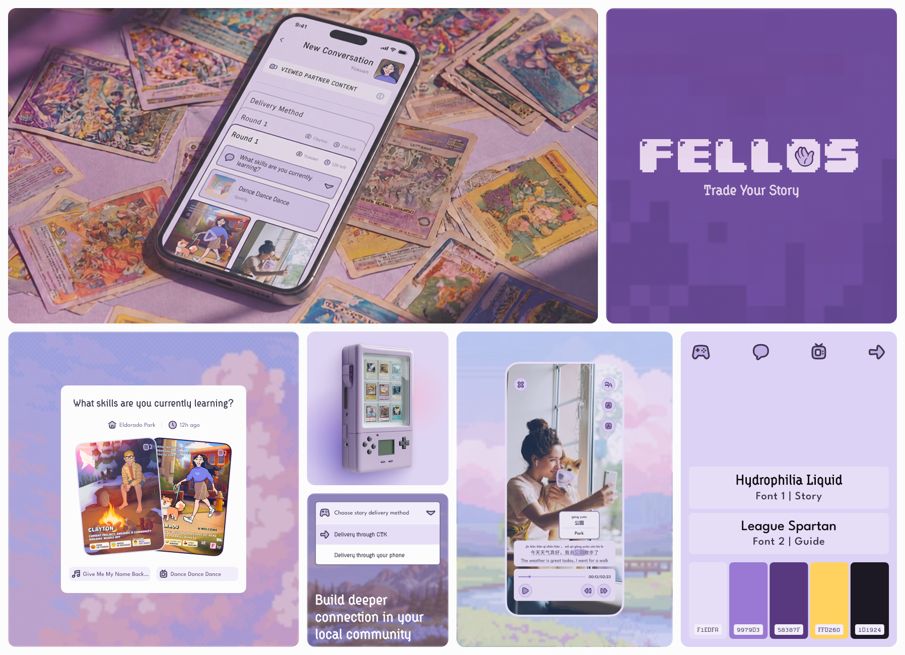
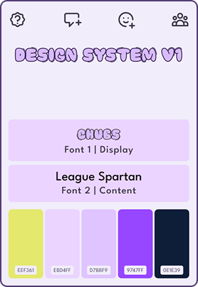
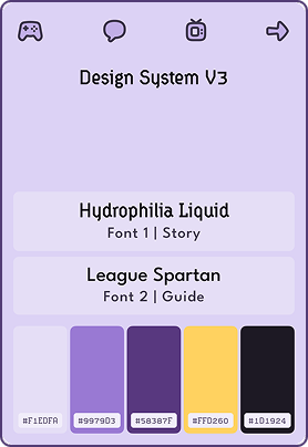
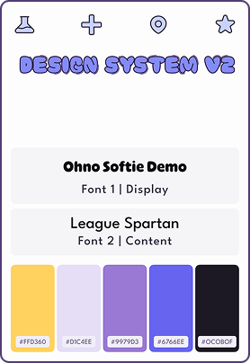
Fellos went through three visual identities.
① A clean minimal foundation to establish the product's core structure.
② A hand-drawn cartoon world built around the ritual of physical card trading.
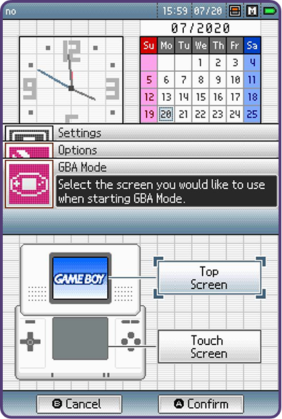
③ A Game Boy inspired design system, unifying card trading and mobile interaction into a palyful experience.
① A clean minimal foundation to establish the product's core structure.
② A hand-drawn cartoon world built around the ritual of physical card trading.
③ A Game Boy inspired design system, unifying card trading and mobile interaction into a palyful experience.
CONTEXT
Building a design system at a startup that pivots is not just maintenance work.
Each time Fellos changed direction, I rebuilt the design language from the ground up, including rethinking what the product looked like, how it communicated, and what culture it carried. Every pivot meant reconstructing the entire visual grammar while keeping engineers shipping
Each time Fellos changed direction, I rebuilt the design language from the ground up, including rethinking what the product looked like, how it communicated, and what culture it carried. Every pivot meant reconstructing the entire visual grammar while keeping engineers shipping
ACHIEVEMENTS
216+
Components

340+
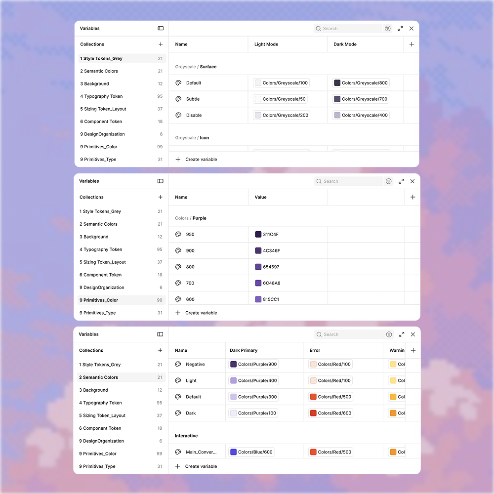
Design Tokens
9
Variable Categorie

click around


216+
Components
Design Decision
Three architectural choices define the current system, including 216 annotated components, each built to maintain a consistent design language across every product pivot.
Here is how the system is structured.
Here is how the system is structured.
Three-tier token architecture
Primitives, semantic tokens, component tokens. When the product pivoted from cartoon to Game Boy, updating the primitive layer once cascaded across all 216 components.
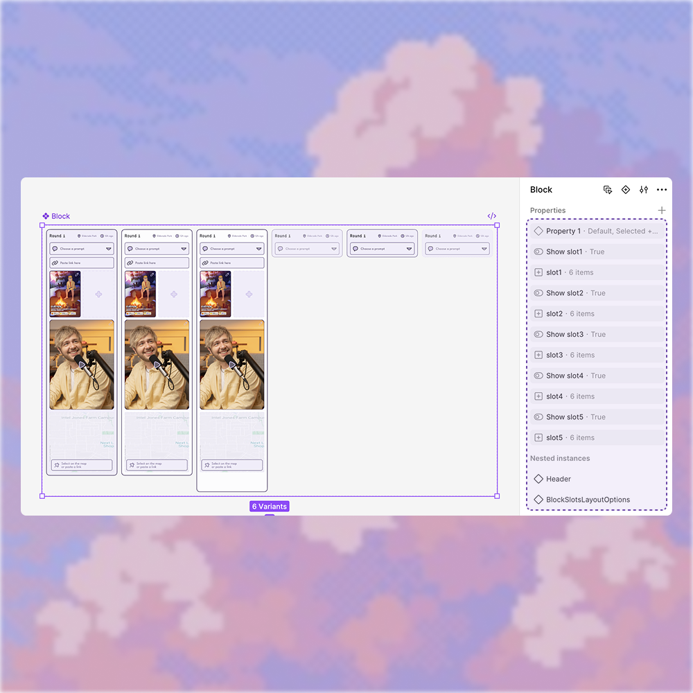
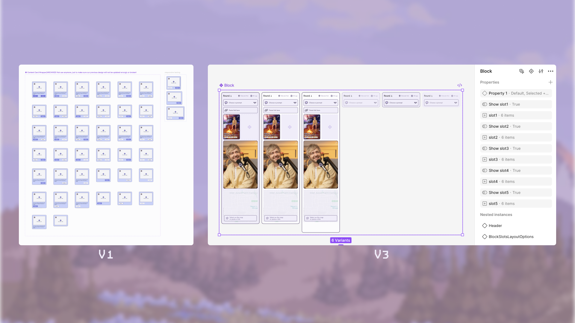
Pluggable slot-based component design
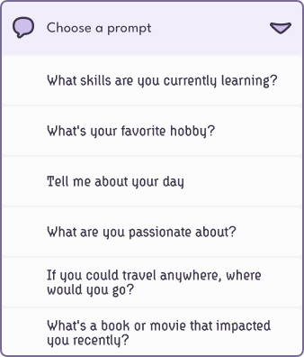
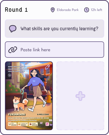
Conversation Cards support 7+ states and multiple content types. Instead of listing every combination as a separate variant, a 5-slot system lets each slot accept any content type independently. Engineers immediately see which parts are swappable and which are fixed.
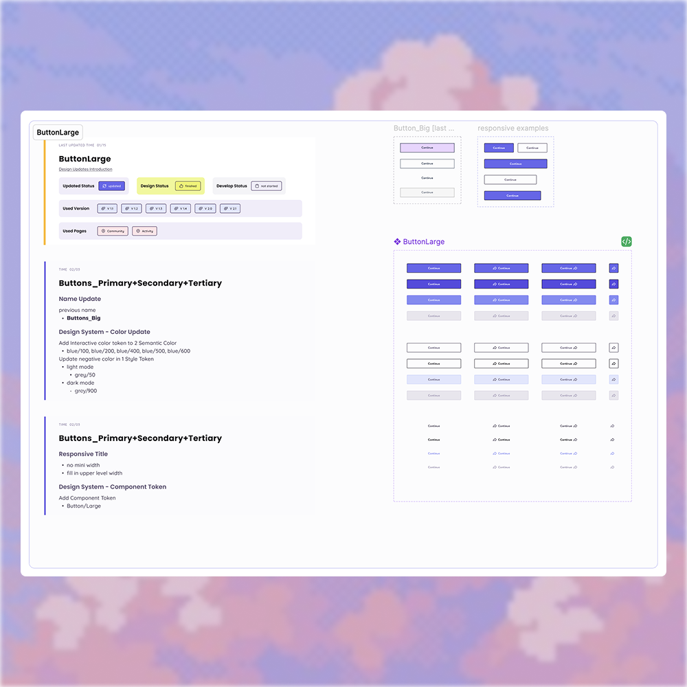
Integrated documentation
Every component carries its own annotation directly in Figma. Usage rules, property configs, and variant specs are visible the moment engineers inspect.
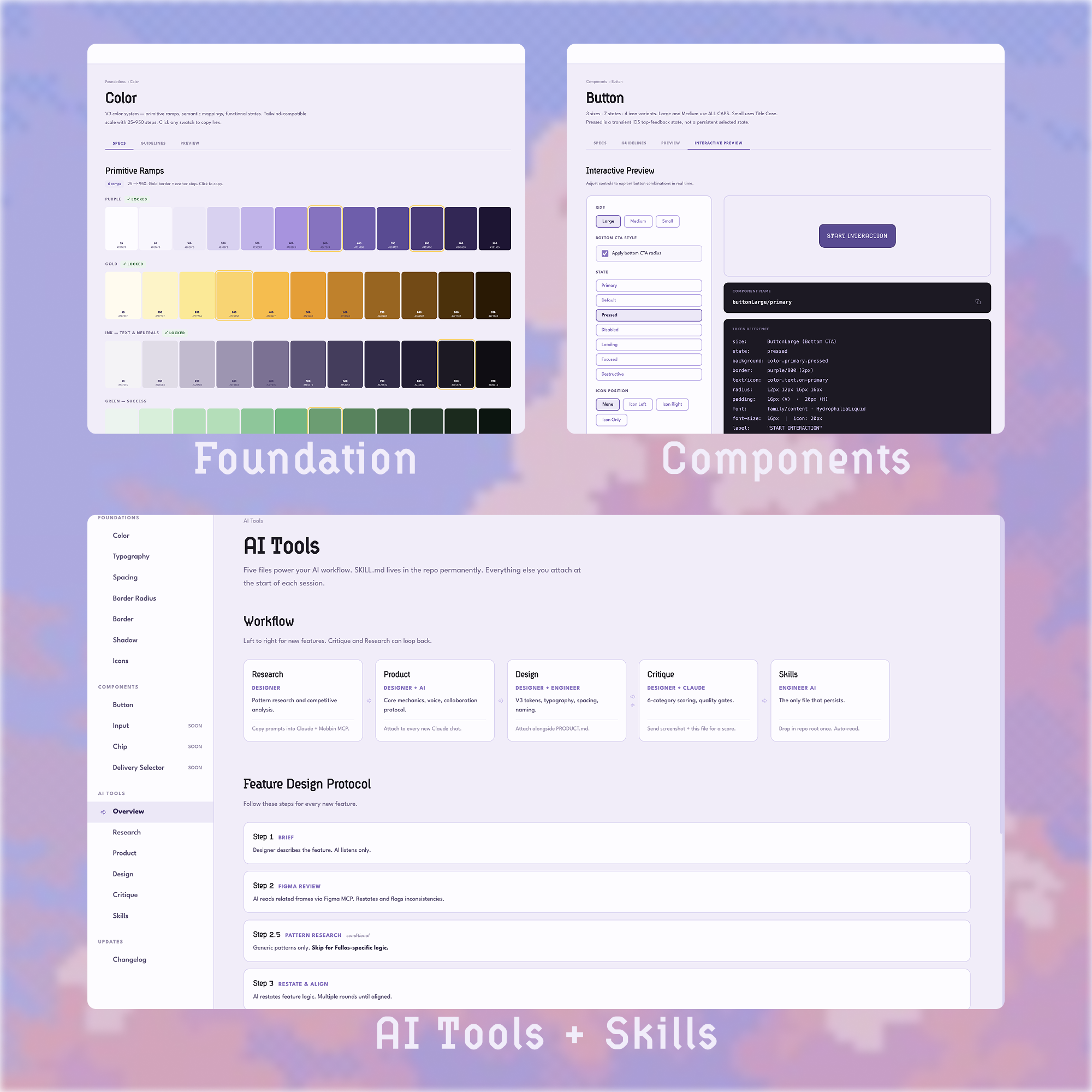
AI-powered design system documentation
Inspired by Google Material Design's documentation, I used Claude to build a centralized reference for the entire Fellos design system. 9 categories, 340+ tokens, AI skills, update logs, all in one place. With built-in Figma MCP and Mobbin MCP integration, designers can access component specs and reference real-world patterns directly within their workflow. It turned the design system from a static file into a living, accessible tool for the entire team.
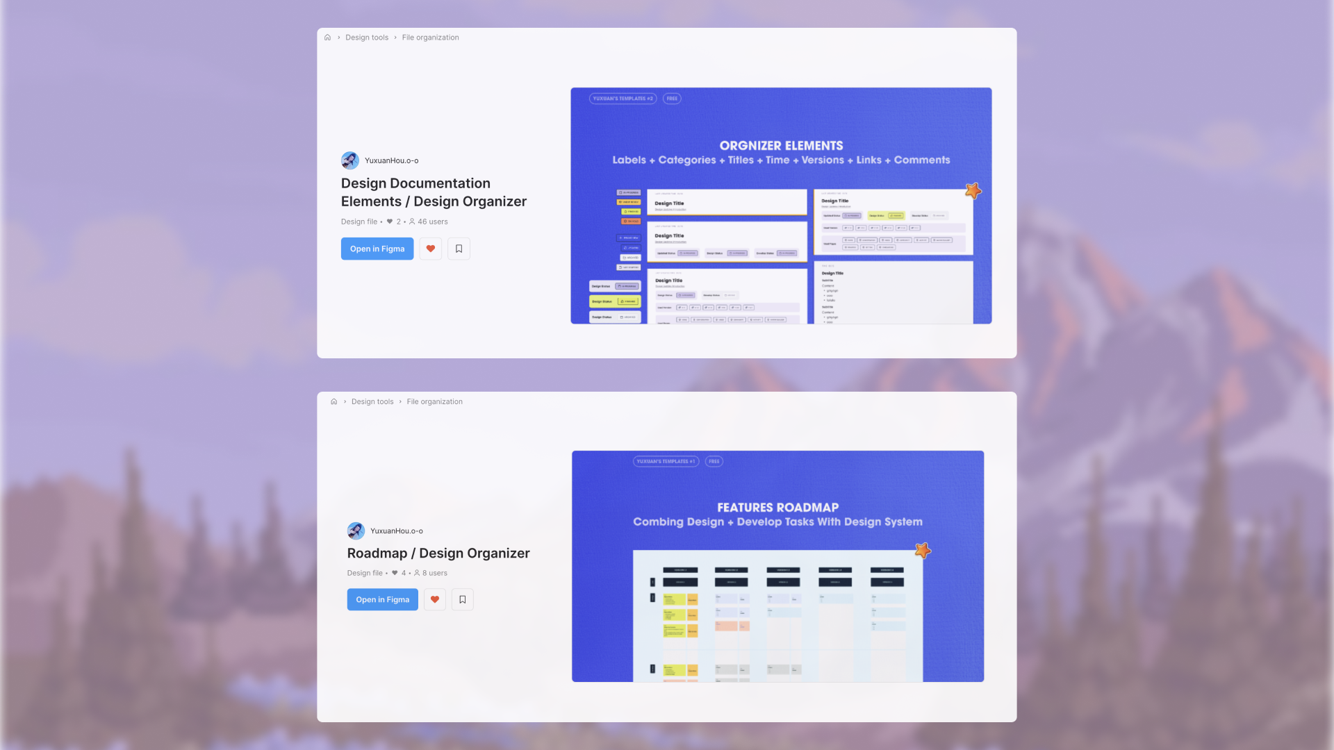
B Side
The annotation framework I built for engineer handoff was packaged as a standalone Figma file and shared publicly on Figma Community for other designers to use.
Reflections
These decisions didn't come naturally. When I first built the component library, my instinct was the most literal one: list every possible card state as a separate variant. One component could have dozens of options. It worked for communication, but it was really hard to maintain or scale.
Through self-directed learning and continuous iteration with our engineer, I discovered that a well-structured component doesn't need to show every possibility. It needs to make every possibility composable.
Through self-directed learning and continuous iteration with our engineer, I discovered that a well-structured component doesn't need to show every possibility. It needs to make every possibility composable.
Building a design system from scratch at an early stage startup taught me as much about restraint as it did about craft. If I were testing a core flow or MVP again, I would start with an existing system and customize later. Speed matters more than originality when you're still validating. But for a product like Fellos with such a specific visual identity, building from scratch was the right call. I wrote more about this journey here.